Color scales in industrial production

Apart from color spaces like sRGB in the graphics world and CIE L*A*B* in industrial production, there also exist color scales - and they play a major role in many industries. What are these color scales exactly and what is their relationship to color spaces?
Light and color distinction
The part of the electromagnetic radiation that we can perceive with our eyes is called light. Since visual perception naturally plays a very important role in our everyday life, it must also be taken into account in a large number of manufacturing processes: Cameras should store the colors of scenes as we see them with our eyes. Displays should in turn show the camera information as planned. During the subsequent printing, the colors should be identical to what was perceived on the screen. During the production of printing pigments, the results of different batches should look identical, etc. - color impressions have to be compared with each other at all these steps.
However, this is not exactly trivial with the human perception of color, because our visual system is the result of various undirected evolutionary processes, and therefore anything but easy to reproduce technically.
The spectrum of visible light extends over wavelengths from approx. 400 to approx. 780nm. The complications already start here: Not all people are identically sensitive, especially at the thresholds of visibility, so these figures are only approximations. And it is probably precisely this area because the star around which our planet orbits also has its highest radiation intensity in exactly this spectrum.
We are also differently sensitive to the individual wavelengths within this range. We perceive two color impressions with a difference of 5nm in the blue range of visible light differently than the same deviation in the green range.
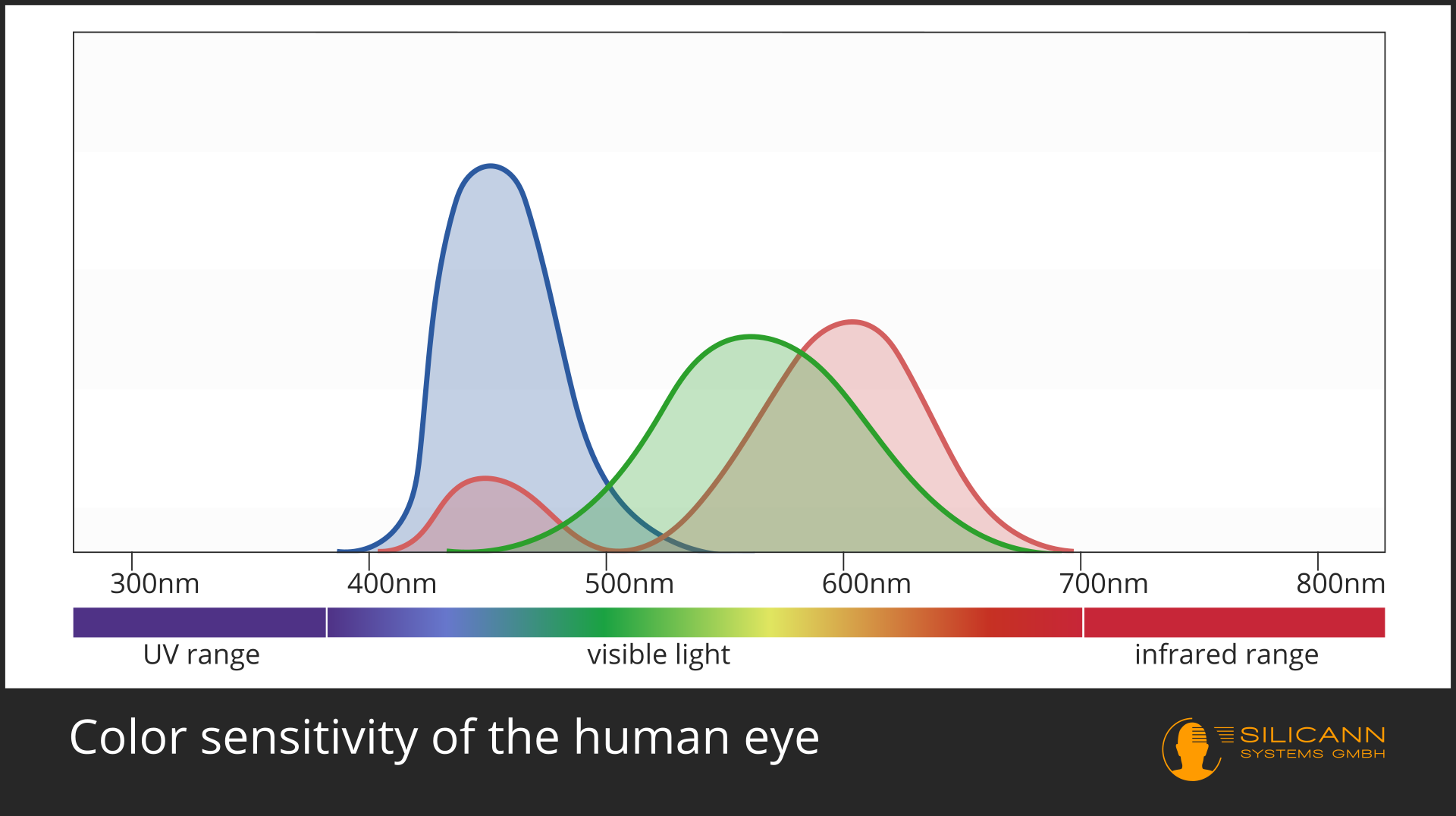
The reason for this can be found in the composition of our retina. Cells that are sensitive to specific wavelengths are located on the retina. If we only had one type of cell, we could only distinguish between radiation intensities, not individual wavelengths. This is exactly how our perception in the dark actually works, and thus the reason why the much-cited cats really are all gray by night for us.
The visualization shows that our visual system has three different cell types, each of which covers its own wavelength range: One cell type each for red, green and blue impressions. The peaks indicate the sensitivity: color impressions in wavelength ranges that are located within these peaks can be very finely differentiated; in contrast to those in the peripheral areas.
And we really don't have any receptors for the color yellow: our brain always reports "yellow" when the receptors for red and green signal approximately equal intensities.
From color impression to color space
Color spaces should help to imitate human color perception as identically as possible in technical processes. The sRGB color space is widespread in the graphics sector and part of almost every product review of devices such as monitors, notebooks or smartphones.
The abbreviation sRGB already suggests it: The vast majority of displays make use of the fact that we only have these three receptors and form the individual pixels only from a red, a green and a blue point.
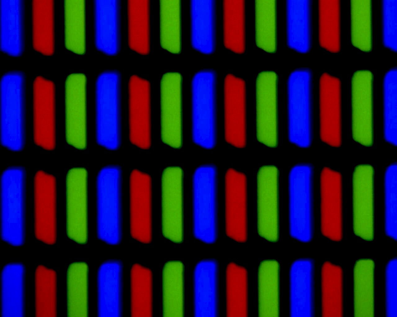
300x enlarged photo of a TN display, source: Akpch/Wikipedia unter CC BY-SA 3.0-Lizenz
sRGB describes a certain range of colors that can be represented in this way: it is a color space. The sRGB color space describes a noticeably smaller area than we actually can see, but it is helpful to describe the coverage area, especially of displays, in a standardized way and thus to make it objectively comparable.
The importance of color differences
A particularly common topic in industrial production is the evaluation of color differences: a batch from the previous day should be visually identical to the current batch, the color of the plastic cover should match the powder-coated frame of a device exactly, and the color pigments ordered by the customer should be exactly the color that has been ordered.
For these applications, a color space should ideally be able to predict the degree of the color impression difference: A numerical difference by the factor X should also correspond as precisely as possible to a color impression difference by the same factor, regardless of the specific color tone.
The sRGB color space can't achieve that, but it also wasn't developed for this task - unlike the L*A*B* color space of the CIE. The LAB color space is now almost 100 years old and has been revised several times during this time. What all versions have in common is the ability to use the value ΔE (for Empfindung, a German word meaning perception) to indicate the degree of difference between two color perceptions, regardless of the color tone. The numerical size of ΔE always corresponds to the identical size of the perceived color difference.
Creation of color scales
CIE was originally founded at the turn of the 20th century from the needs of the gas lighting industry. It's goal was to develop standards for light measurement. Within a few years, however, CIE's field of work expanded to include other industries with an interest in objective color measurement over the entire range of visible light. In other industries, it is often only the intensity of a very specific color that is of interest.
An example of the latter is the brewery. In order to be able to objectively compare and categorize beers of different origins and types of brewing, an attempt was made early on to establish a standard. However, since beers rarely appear green or blue, they naturally limited themselves to the colors between yellow and brown: a color scale was developed.
This early color scale, developed by Joseph Williams Lovibond, was created towards the end of the 19th century, decades before the LAB color space, and it was also less concerned with mathematical precision. Instead, it was defined as a specific series of glasses tinted do various degrees. A beer was classified by comparing the sample being held against a light source at the same time as these colored glasses. The tint of the glasses was not objectively defined, but was only available as a product from Lovibond's company (unlike its successor, the objectively defined SRM scale from EBC).
Many other industries had very similar needs, but for different shades, and so a multitude of different color scales has been developed for these industries. While many have been forgotten over the decades, others have asserted themselves and have been formalized as industrial standards, by standardization bodies such as DIN, ISO, AOCS or ASTM.
An overview of important color scales
The number of currently used color scales is at least in the three-digit range. The following examples, however, are color scales that are used relatively frequently across industries and have also been defined by cross-industry standardization institutions.
All the color scales mentioned refer to clear, transparent liquids. Accordingly, the following graphics are only to be understood as an approximate guide.
AOCS color scale / Lovibond color scale
The AOCS color scale has its origin in the comparison of different types of beer using Lovibond glasses, as described above.
Nowadays, however, it can be determined objectively, as there are defined standards with which color measuring devices can be calibrated. The use of this scale is standardized in AOCS Cc 13b-45 for manual measurement and in AOCS Cc 13j-97 for automatic measurement.
ISO 27608 and AOCS Cc 13e-92 determine the use of this scale for the classification of animal and vegetable fats and oils.
The colors that can be described with this scale range from a light yellow to a very dark brown tone - at first glance there are strong similarities in the spectrum shown for the ASTM color scale (see below).
Platinum-cobalt color scale (abbreviated: Pt-Co color scale, deprecated: Hazen oder APHA color scale)
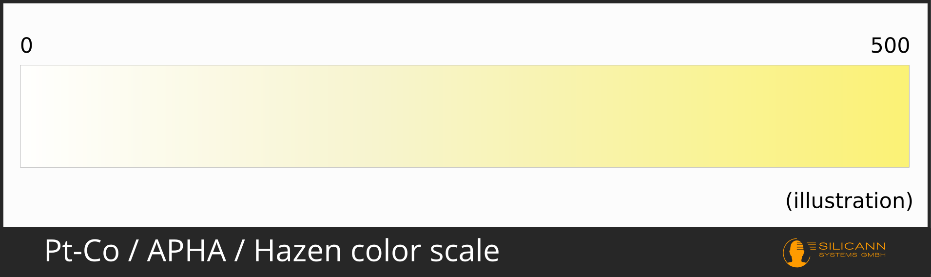
The platinum-cobalt color scale is often named after its founder Hazen or APHA color scale, but according to the current ISO standard, all designations except platinum-cobalt are considered deprecated.
According to ISO, this color scale is defined as a series of differently concentrated solutions of the eponymous elements.
The colors that can be reproduced range from completely clear liquids, such as distilled water, to a distinct shade of yellow. The Pt-Co scale is defined in ISO 1557, ISO 6371, ASTM 1209 and DGK F 040, among others.
This scale is used in many industries, e.g. for the classification of mineral oil-based products, for paints and varnishes up to table vinegar (EN ISO 13189).
ASTM color scale
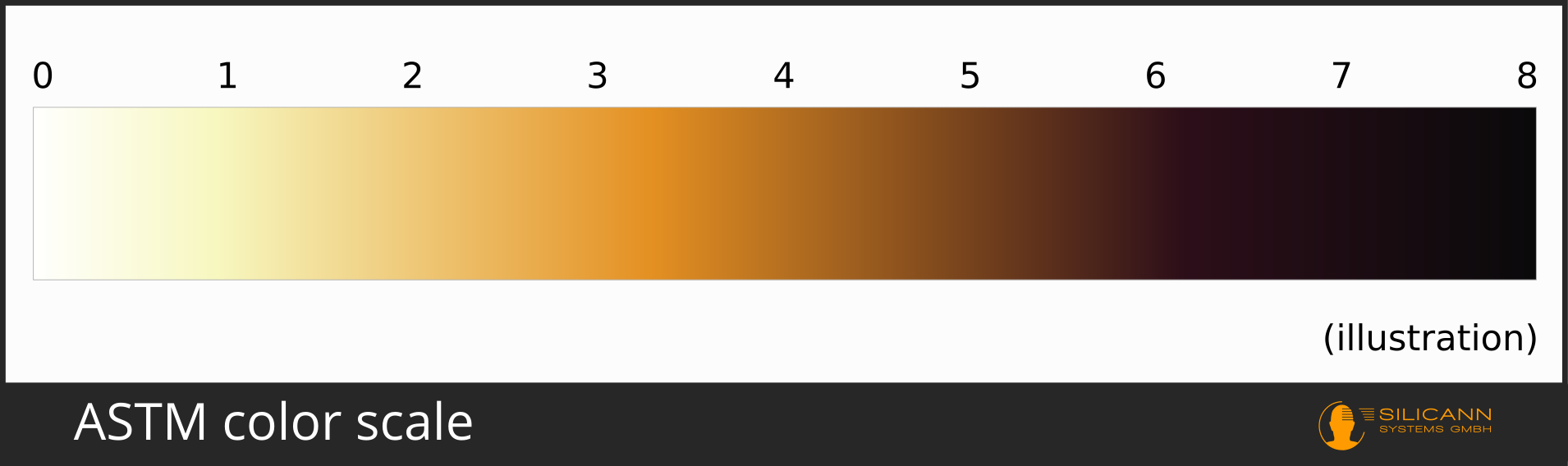
The ASTM color scale ranges from light yellow to a very deep, dark brown.
It is standardized in ASTM D6045 for the automatic measuring process and ASTM D1500 for manual comparisons with references. The ISO also knows ASTM color: It defines it in ISO 2049.
Saybolt color scale

The spectrum represented by the Saybolt color scale is the brightest of the scales described here. It ranges from complete colorlessness to a light yellow. The entire range of Saybolt colors is also in the ASTM color scale, between the ASTM values of 0 and 0.5.
The Saybolt scale is standardized in ASTM D6045 for automated measurement and ASTM D156 for manual measurement. Its main area of application is the measurement of mineral oil-based products.
Gardner color scale
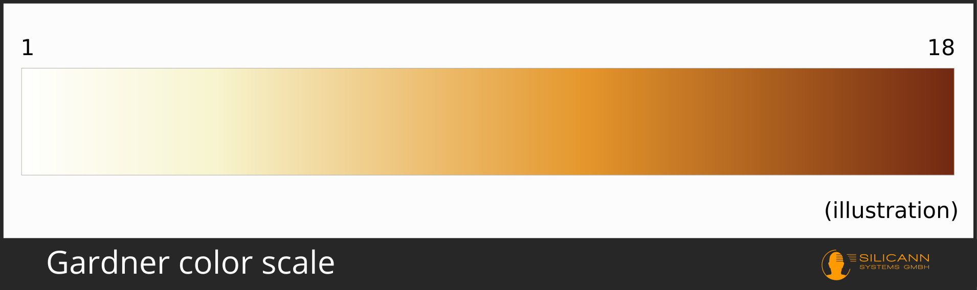
This color scale roughly describes the brighter half of the ASTM color scale. As with ASTM color, one of the main uses is in the mineral oil processing industry.
It is standardized in ASTM D6166 (formerly also ASTM D1544, but this standard has since been withdrawn), ISO 4630, ISO 2049, EN ISO 1557, DGK C-IV-4c and DGK F 010.
Industrial measurement using color scales
It is not enough to define a color scale; samples now have to be compared with the reference in production. There are still measuring devices that humans can use to make this comparison manually: colored glasses or liquids are set manually and compared with the sample taken from the manufacturing process.
Ideally, however, the color should not be measured manually, but fully automatically. Measurements can then be carried out much more frequently and also faster, which significantly shortens the period from detecting an error to correcting it - and thus also its costs.
Automatic color comparisons with the color scales mentioned are usually implemented using spectrometers. These devices record a complete spectrum, such as the range of visible light, in fine detail and can then process this information further. In the case of color scales, a color value in the CIE L*A*B* color space is often calculated from the spectrum and a classification on the desired color scale is carried out on the basis of this color value. Since there is no mechanical back and forth movement of colored glasses, measurements can take place many times per second, directly in the production process.